Below is the user’s guide I put together for individuals who use the ElasticSearch system I support at work to help them transition to the OpenSearch platform we’ll be moving to later this year.
Overview
The SYSLOG platform is a set of applications commonly known as ELK (ElasticSearch, Logstash, and Kibana). We will be replacing ElasticSearch with OpenSearch in the upcoming months. Currently, the development platform has been upgraded and is available for anyone who wants to check it out. The new website is called “OpenSearch Dashboards”. While maintaining a similar “look and feel” to the current Kibana platform, moving to OpenSearch provides us with new features – machine learning for data analytics, rollup indices.
What is ElasticSearch?
ElasticSearch, based on the Lucene search software, is a distributed search and analytics application which ingests, stores, and indexes data. Kibana is a web-based front-end providing user access to data stored within ElasticSearch.
What is OpenSearch?
In short, it’s the same but different. OpenSearch is also based on the Lucene search software, is designed to be a distributed search and analytics application, and ingests/stores/indexes data. If it’s essentially the same thing, why does OpenSearch exist? ElasticSearch was initially licensed under the open-source Apache 2.0 license – a rather permissive free software license. ElasticCo did not agree with how their software was being used by Amazon; and, in 2021, the license for ElasticSearch was changed to Server Side Public License (SSPL). One of the requirements of SSPL is that anyone who implements the software and sells their implementation as a service needs to publish their source code under the SSPL license – not just changes made to the original program but all other software a user would require to run the software-as-a-service environment for themselves. Amazon used ElasticSearch for their Amazon Elasticsearch Service offering, but was unable/unwilling to continue doing so under the new license terms. In April of 2021, Amazon Web Services created a fork of ElasticSearch as the basis for OpenSearch.
Differences Between OpenSearch and ElasticSearch
After the OpenSearch fork was created, the product roadmap for ElasticSearch was driven by ElasticCo and the roadmap for OpenSearch was community driven (with significant oversight and input from Amazon) – this means the products are not identical although they provide the same core functionality. Elastic publishes a list of features unique to ElasticSearch, and the underlying machine learning algorithms are different. However, the important components of the “unique” feature list have been implemented in OpenSearch over time.
Requesting Access
Access to the OpenSearch environment can be requested via a Microsoft Forms form.
Managers can request access for their direct reports at https://forms.microsoft.com/Pages/ResponsePage.aspx?id=wbRnJe2w9UCu41jXxfPisjf18JL-t61BkoGkoNxr24lUN1laRDhaU0lRMzRHVzNZRkdCSTlXQUFNNSQlQCN0PWcu
Individual can request access, to be approved by their manager, at https://forms.microsoft.com/Pages/ResponsePage.aspx?id=wbRnJe2w9UCu41jXxfPisjf18JL-t61BkoGkoNxr24lUMk0zRVJIQURTTFc0RkpKOTdINkREM0s4MiQlQCN0PWcu
Logging In
You will be able to log into the OpenSearch Dashboards site using the same https://syslogging.vip.windstream.net:5601/ URL. For now, though, the DEV OpenSearch installation is available at https://ltrkarkvm1577.mgmt.windstream.net:5601 – log in through PingID

And you will be at the OpenSearch Dashboards home page

To navigate around the site, click on the hamburger button in the upper left-hand corner of the page

Switching Tenants
Data from different sources are sorted into “tenants” – you may only have access to a single tenant. In the upper right-hand corner of the page, there will be a circle with a letter – click that circle. The current tenant will be displayed under your username (the tenant shown here is ‘admin_tenant’). On the same menu, there is an option to “Switch tenants”

Clicking “Switch tenants” will bring up a new pane – you can chose the tenant you want from the drop-down. Click “Confirm” to switch to the selected tenant.

Searching
Searching: Discover Overview
To perform ad hoc queries against stored data, use the hamburger button to expand the left-hand navigation menu and select “Discover”.

“Discover” lets you perform ad hoc queries against the stored data using the same query language as was used in ElasticSearch

You will notice that “documents” stored in OpenSearch have key:value pairs (field names and data, categories and info, etc) – in this example, “fields” such as “log.offset”, “agent.hostname”, “@timestamp”, “source”, “tags”, “hostname”, “input.type”, “index”, “Sourcetype”, “host.hostname”, “host.architecture”, etc exist. Each field has a value — “@timestamp” is August 17, 2022 at 16:21:20.518 – and you can use the search to find documents matching your criteria.

Search Tips
Selecting the Time Range
When you search stored data, the default is to search the last 15 minutes of data. To change this time range, click on the calendar icon next to the “Last 15 minutes” text and select the time range you want to display

To search for a specific time range,click on the “Show dates” text

There will now be two fields for the start and end range of the time span. You can click on either the start or end time to set those values. Clicking on one, you will see three options – “Now” means the range start/end will be set to whatever the current date/time is when the search is performed or refreshed. “Relative” allows you to specify an interval (I know this happened in the last three hours, so I can search from 3 hours ago to now).

Absolute allows you to chose a date and time

Viewing Data
When viewing log data, there are several parts of the screen. The top right quadrant has a histogram showing how many matching documents have been found over the time interval.

Hovering your mouse over a column will show you the exact count and time interval – in this example, each column represents a 10 minute period, and 2,788 documents matched the search

Below the histogram, you will see the records – the default display has the document timestamp and the entire message (Source). To view a single record, click the magnifying glass icon next to the record.

A new pane will appear on the right-hand side with the document details.

Clicking the “+” before a field value will filter the records to just those where the field has the value displayed

In this example, we now have all records where “Action” is “Login”

And finally, the left-hand column displays the fields found within the documents. Clicking the magnifying glass next to a field will display the top 5 frequently occurring values for that field – 7.7% of the records have “TELNET” as the port value in this example.

Clicking on the + next to the TELNET value will filter the searched records to just those where Port is TELNET – clicking the minus would filter records to everything where Port is not TELNET

Selecting Displayed Field
When viewing the field list, you can click the plus icon next to a field to change the values displayed in the table data.

The fields displayed in the table will be listed in “Selected Fields” at the top of the fields list

Clicking the red X next to a selected field will remove it from the data table.

Basic Search
To search for a full string, indicate the field name that you want to search followed by a colon. Then enter what you want to find. As an example, finding records from the BNG named bng04.lncl01-ne.us.windstream.net means entering
hostname: bng04.lncl01-ne.us.windstream.net

Wildcard Search
You can use ? to match any single character – this is useful when you are searching for a number of hosts simultaneously (dns??.example.com will match dns01.example.com though dns99.example.com).
You can use * to match zero or more characters – this means dns*.example.com would match dns.example.com, dns1.example.com, and dns1234568793.example.com
Substring Search
To search for a substring, use * around your search string – looking for documents from any of the devices with inmn01-sc in their name, search for:
"source": *inmn01-sc.us*

Search for a String That Contains Word Boundaries
When your search string contains something the tokenizer considers a word boundary (the “.” characters in hostnames, for example), you may find the results contain more than you want. Basically, searching for foo.bar will return any document matching foo and any document matching bar
You can add * as a wildcard around your substring – to find any of the lncl01-ne.us devices, search for
hostname: *lncl01-ne.us*

Searching for text that contains colons (:)
If you are searching for a string that contains colons (for example a MAC address), you need to add quotes around the string
message: "94:1c:56:1c:5b:11" and hostname: *lncl01-ne.us*

Excluding Data From a Search
If your query is returning too many records and there are some that aren’t relevant (in this case, we’re getting a lot of log data and don’t really care about the “stuff” from /var/log/messages which is basically OS related logs). To exclude data, add “not” to your query. As an example:
hostname: *lncl01-ne.us* and not source:"/var/log/messages"

Inspect
Inspect will show you information about the data presented in the search –

Clicking on ‘Request” will show you the API search request that has been made – this is useful for people building programmatic access to data. You can copy/paste the JSON text and submit it to the OpenSearch search API.

New Discover
In addition to the search that matches Kibana, OpenSearch also includes a new search interface. Click “Try new Discover” to switch (you can always click “Use legacy Discover” to switch back!)

The query language and basic functionality is the same, but information is presented in a different format.

Saving Searches
Clicking “Save” will bring up a new pane that allows you to save a query for future use.

Exporting Report Data
Saving a query allows you to click on “Reporting” to export data

This will bring up a menu that allows you to generate a CSV file with the matching records.

Accessing Saved Queries
To access a saved query, select “Open”

On the new menu, select the saved query you wish to view

Creating Visualizations
General
To create a new visualization, use the hamburger button to expand the left-hand navigation menu and click “Visualize”. You will be able to view any existing visualizations.

Click “Create visualization” to create a new visualization.

You’ll need to select the type of visualization you wish to create.


TSVB (Time Series Visualization Builder)
The Time Series Visualization Pipeline is a GUI visualization builder to create graphs from time series data. This means the x-axis will be datetime values and the y-axis will the data you want to visualize over the time period. To create a new visualization of this type, select “TSVB” on the “New Visualization” menu.

Scroll down and select “Panel options” – here you specify the index you want to visualize. Select the field that will be used as the time for each document (e.g. if your document has a special field like eventOccuredAt, you’d select that here). I generally leave the time interval at ‘auto’ – although you might specifically want to present a daily or hourly report.

Once you have selected the index, return to the “Data” tab. First, select the type of aggregation you want to use. In this example, we are showing the number of documents for a variety of policies.

The “Group by” dropdown allows you to have chart lines for different categories (instead of just having the count of documents over the time series, which is what “Everything” produces) – to use document data to create the groupings, select “Terms”.

Select the field you want to group on – in this case, I want the count for each unique “policyname” value, so I selected “policyname.keyword” as the grouping term.

Voila – a time series chart showing how many documents are found for each policy name. Click “Save” at the top left of the chart to save the visualization.

Provide a name for the visualization, write a brief description, and click “Save”. The visualization will now be available for others to view or for inclusion in dashboards.

Map Visualizations
Before we can use map details in OpenSearch visualizations, we need to add fields with the geographic information. The first few steps are something the ELK admin staff will need to do in order to map source and/or destination IPs to geographic information. Once GeoIP information is available in the index pattern, select the “Maps” visualization

Leave the road map layer there (otherwise you won’t see the countries!)

Select ‘Documents’ as the data source to link in ElasticSearch data

Select the index pattern that contains your data source (if your index pattern does not appear, then Kibana doesn’t recognize the pattern as containing geographic fields … I’ve had to delete and recreate my index pattern so the geographic fields were properly mapped … but refreshing the fields should be sufficient).

And select the field(s) that contain geographic details:

You can name the layer

And add a tool tip that will include the country code or name

Under “Term joins”, add a new join. Click on “Join –select–” to link a field from the map to a field in your dataset.

In this case, I am joining the two-character country codes —

Normally, you can leave the “and use metric count” in place (the map is color coded by the number of requests coming from each country). If you want to add a filter, you can click the “where — add filter –” link to edit the filter.

In this example, I don’t want to filter the data, so I’ve left that at the default.

Click “Save & close” to save the changes to the map visualization. To view your map, you won’t find it under Visualizations – instead, click “Maps” along the left-hand navigation menu.

Voila – a map where the shading on a country gets darker the more requests have come from the country.

TimeLine
TimeLine can be used to build time series graphs.

This visualization type is a little cryptic – you need to enter Timelion expression — just change the “.es(…)” to “.opensearch(…)” to retrieve data from OpenSearch
If there is null data at a time value, TimeLine will draw a discontinuous line. You can modify this behavior by specifying a fit function.

Note that you’ll need to click “Update” to update the chart before you are able to save the visualization.
Vega
Vega is an experimental visualization type.

This is, by far, the most flexible but most complex approach to creating a visualization. I’ve used it to create the Sankey visualization showing the source and destination countries from our firewall logs. Both Vega and Vega-Lite grammars can be used. ElasticCo provides a getting started guide, and there are many example online that you can use as the basis for your visualization.

Learning Vega
Both Vega and Vega-Lite are … not the best documented grammars I’ve ever encountered. This means there’s a lot of trial and error involved in getting a chart set up. There’s a Vega web editor that allows you to see the data tables that are being used to create graphs – this lets you confirm your transformations and such are functional.

Debugging Vega Graphs
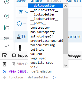
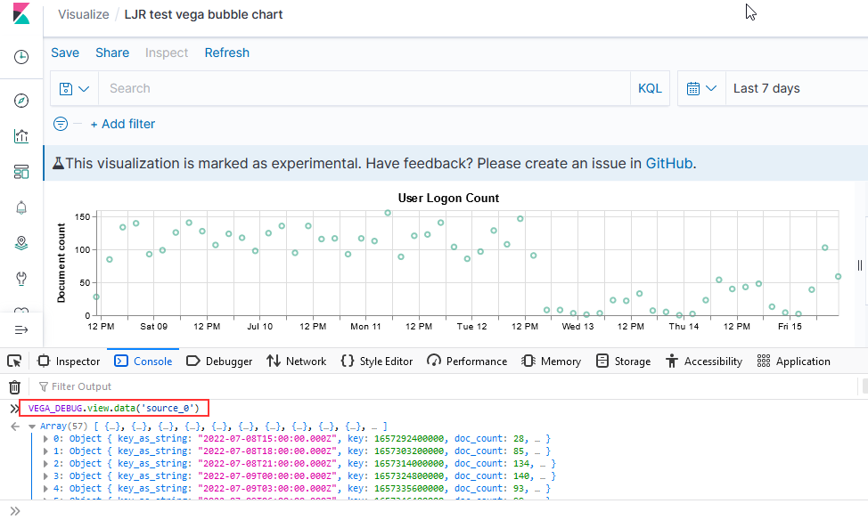
If you open the browser’s developer console, you can access debugging information. This works when you are editing a visualization as well as when you are viewing one. To see a list of available functions, type VEGA_DEBUG. and a drop-down will show you what’s available. The command “VEGA_DEBUG.vega_spec” outputs pretty much everything about the chart.

To access the data set being graphed with the Vega Lite grammar, use “VEGA_DEBUG.view.data(“source_0)” — if you are using the Vega grammar, use the dataset name that you have defined.

Vega Sample – Horizontal Line with Baseline
This is the graph that’s used for the OTDR scans – someone identifies a baseline “as good as this circuit is going to get” loss value that is retained forever, and that value is used as a comparison for future scans. Sounded easy enough – draw a horizontal line at this y-value. Finding this y-value required using an array of data elements instead of a single data element. Drawing the line, however, was challenging.
There’s a “rule” mark that draws a straight line between two points. You cannot just say “draw a line at y from 0 to some large value that’s going to be off the graph. You cannot just get the max value of the axis.
The joinaggregate transformation method — which appends the value to each element of the data set — was essential because I needed to know the largest datetime value that would appear in the chart.
, {“type”: “joinaggregate”, “fields”: [“transformedtimestamp”], “ops”: [“max”], “as”: [“maxtime”]}
The lookup transformation method — which can access elements from other data sets — allowed me to get that maximum timestamp value into the baseline data set. Except … lookup needs an exact match in the search field. Luckily, it does return a random (I presume either first or last … but it didn’t matter in this case because all records have the same max date value) record when multiple matches are found.
So I used a formula transformation method to add a constant to each record as well
, {“type”: “formula”, “as”: “pi”, “expr”: “PI”}
Now that there’s a record to be found, I can add the max time from our scan data into our baseline data
, {“type”: “lookup”, “from”: “scandata”, “key”: “pi”, “fields”: [“pi”], “values”: [“maxtime”], “as”: [“maxtime”]}
Voila — a chart with a horizontal line at the baseline loss value. Yes, I randomly copied a record to use as the baseline and selected the wrong one (why some scans are below the “good as it’s ever going to get” baseline value!). But … once we have live data coming into the system, we’ll have reasonable looking graphs.

The Vega spec for this graph:
{
“$schema”: “https://vega.github.io/schema/vega/v4.json“,
“description”: “Scan data with baseline”,
“padding”: 5,
    "title": {
        "text": "Scan Data",
        "frame": "bounds",
        "anchor": "start",
        "offset": 12,
        "zindex": 0
      },
    "data": [
    {
        "name": "scandata",
        "url": {
            "%context%": true,
            "%timefield%": "@timestamp",
            "index": "traces-*",
            "body": {
            "sort": [{
                "@timestamp": {
                    "order": "asc"
                }
            }],
            "size": 10000,
            "_source":["@timestamp","Events.Summary.total loss"]
            }
        }
        ,"format": { "property": "hits.hits"}
        ,"transform":[
            {"type": "formula", "expr": "datetime(datum._source['@timestamp'])", "as": "transformedtimestamp"}
            , {"type": "joinaggregate", "fields": ["transformedtimestamp"], "ops": ["max"], "as": ["maxtime"]}
            , {"type": "formula", "as": "pi", "expr": "PI"}
        ]
    }
  ,
   {
        "name": "baseline",
        "url": {
            "%context%": true,
            "index": "baselines*",
            "body": {
                "sort": [{
                    "@timestamp": {
                        "order": "desc"
                    }
                }],
                "size": 1,
                "_source":["@timestamp","Events.Summary.total loss"]
            }
        }
        ,"format": { "property": "hits.hits" }
        ,"transform":[
                {"type": "formula", "as": "pi", "expr": "PI"}
                , {"type": "lookup", "from": "scandata", "key": "pi", "fields": ["pi"], "values": ["maxtime"], "as": ["maxtime"]}
        ]
  }
]
,
    "scales": [
      {
        "name": "x",
        "type": "point",
        "range": "width",
        "domain": {"data": "scandata", "field": "transformedtimestamp"}
      },
      {
        "name": "y",
        "type": "linear",
        "range": "height",
        "nice": true,
        "zero": true,
        "domain": {"data": "scandata", "field": "_source.Events.Summary.total loss"}
      }
    ],
        "axes": [
      {"orient": "bottom", "scale": "x"},
      {"orient": "left", "scale": "y"}
    ],
     "marks": [
                {
            "type": "line",
            "from": {"data": "scandata"},
            "encode": {
              "enter": {
                "x": { "scale": "x", "field": "transformedtimestamp", "type": "temporal",
      "timeUnit": "yearmonthdatehourminute"},
                "y": {"scale": "y",       "type": "quantitative","field": "_source.Events.Summary.total loss"},
                "strokeWidth": {"value": 2},
                "stroke": {"value": "green"}
              }
            }
          }
                 ,        {
            "type": "rule",
            "from": {"data": "baseline"},
            "encode": {
              "enter": {
                "stroke": {"value": "#652c90"},
                "x": {"scale": "x", "value": 0},
                "y": {"scale": "y",      "type": "quantitative","field": "_source.Events.Summary.total loss"},
                "x2": {"scale": "x","field": "maxtime", "type": "temporal"},
                "strokeWidth": {"value": 4},
                "opacity": {"value": 0.3}
              }
            }
          }
     ]
}
Other Types:
Area
Controls allow you to add a control bar to a dashboard – this enables the user to select date ranges, add filters, and otherwise control the data being displayed in the dashboard.
Coordinate Map
Data Table
Gantt Chart
Gauge
Goal
Heat Map
Horizontal Bar
Line
Markdown
Metric
PPL
Pie
Region Map
Tag Cloud
Vertical Bar
VisBuilder
Creating a Dashboard
General
To create a dashboard, use the hamburger button to expand the left-hand navigation menu and select “Dashboards”

Click “Create” to create a new dashboard

Select the type of dashboard you wish to create

Dashboard
Click “Add” to add existing visualizations to the dashboard (or create a new one).

Select the dashboards you want added, then click “Save” to save your dashboard.

Provide a name and brief description, then click “Save”.

Observability Dashboard
Provide a name for the dashboard

Use the “Add visualization” button to create new visualizations or link existing ones into the dashboard.

More details about the Observability plugin can be found at https://github.com/opensearch-project/dashboards-observability/wiki and https://github.com/opensearch-project/dashboards-observability/wiki


