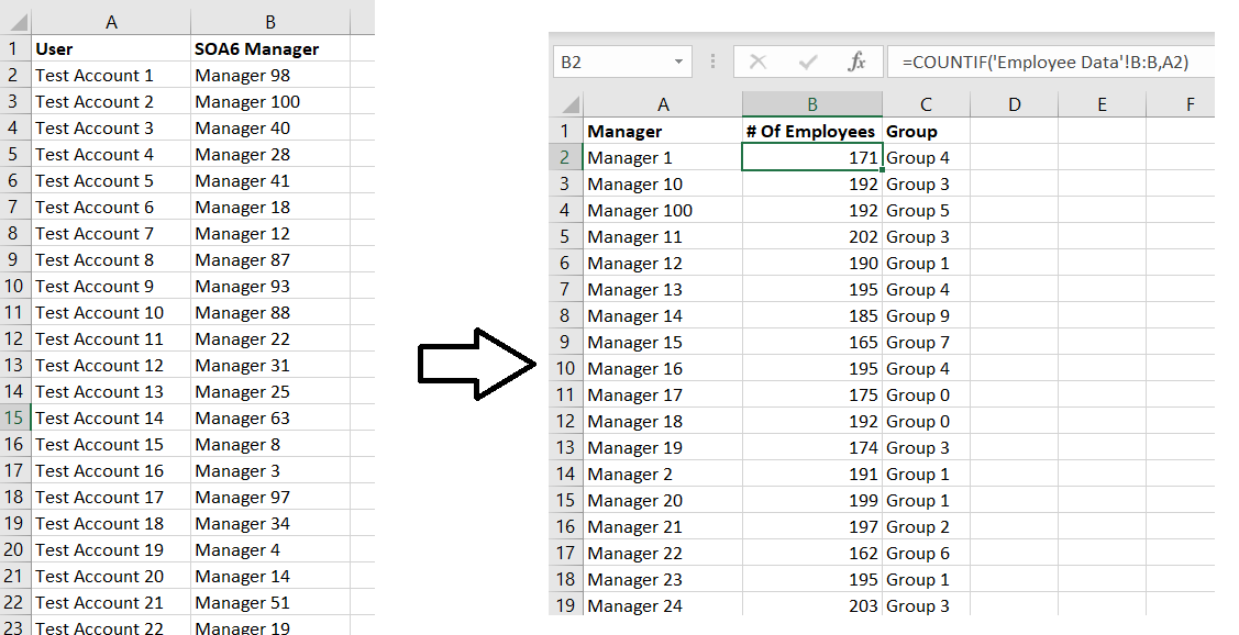
For a project, we need to divide the entire company into groups. I chose organizational structure because it’s easy – I can determine the reporting structure for any employee or contractor, and I can roll people into groups under which ever level of manager I want.
The point of making groups, though, is to have close to the same number of people in each group. While I can use COUNTIFS to count the number of people who report up through each manager, I need to add those totals for each group of managers to determine how many individuals fall in each group. How many employees are included in Group 0?
This is actually quite easy – just like count has a conditional counterpart, countifs, sum has a conditional counterpart sumifs
The usage is =SUMIFS( Range Of Data To Sum, Range Of Data Where Criterion Needs To Match, Criterion That Needs To Match)
You can use multiple criteria ranges and corresponding criteria in your conditional sum — =SUMIFS(SumRange,CriterionRange1,CriterionMatch1,CriterionRange2,CriterionMatch2,…,CriterionRangeN,CriterionMatchN).
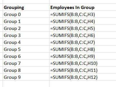
I only have one condition, so with a quick listing of the groups, I can add a column that tells me how many individuals are included in each group.
Bonus did you know – instead of specifying a start and end cell for a range, you can use the entire column. Instead of saying my “Range of data to sum” is B2:B101, I just used B:B to select the entire “B” column.
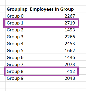
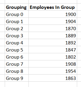
Viewing the values, I can see that my group size is not consistent.
As I adjust the group to which the manager is assigned, these sums are updated in real-time.
Being able to save documents directly to Teams, to sync documents and work on them locally, and to just store documents locally provides a lot of options when you’re saving a document. For me, though, a lot of options also means I’m not always sure which option I chose 😊 In which Teams space is this document saved? Did I stash it locally because I’m not ready for other people to peruse it?
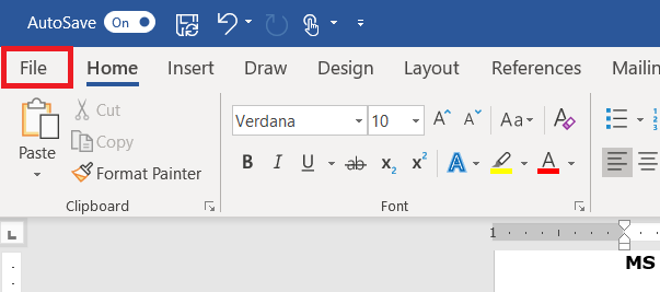
Luckily where the document is saved can quickly be displayed in the Office 365 applications. Click “File” on the ribbon bar.
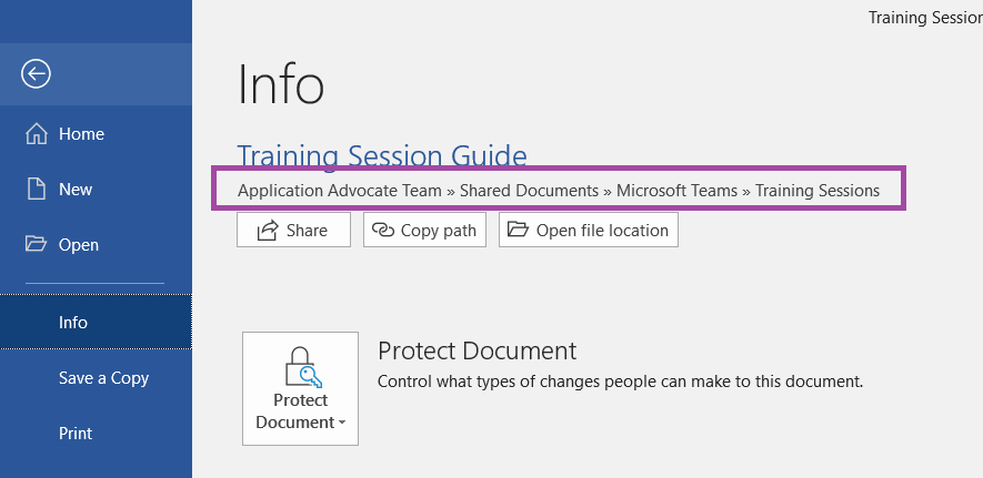
The “Info” section contains the path to the document – a document that is stored in a SharePoint document library (be that a Teams Channel file space or some other SharePoint document library) will include the SharePoint site name (the Team name in the case of Teams Channel files). Clicking “Open file location” will open a browser tab to the SharePoint document library which contains the file.
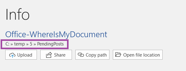
A document on a local or network drive will have a path starting with the drive letter. Clicking “Open file location” will open a File Explorer window to the folder containing the document.
And a document that hasn’t been saved won’t have any file information listed.
I frequently need to correlate two sets of data – generally information about accounts, where the logon ID will be found in both data sets. I’ve imported my information into Access, defined a relationship between the two tables, and used a query to correlate my data. I’ve written quick scripts to pull the data into an associative array for correlation. These are not quick approaches.
Using the VLOOKUP function in Excel, you can search through data in rows and retrieve values from the record’s other columns. HLOOKUP provides the same function, but searches data in columns and retrieves values from the record’s other rows (Vertical Lookup and Horizontal Lookup).
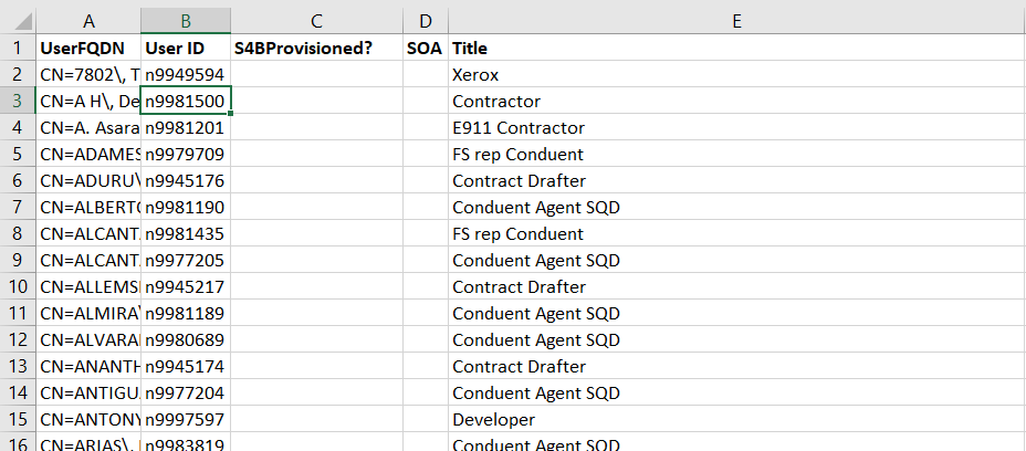
Today, I have a list of individuals with their reporting structure and need to identify which accounts have Skype for Business provisioned.
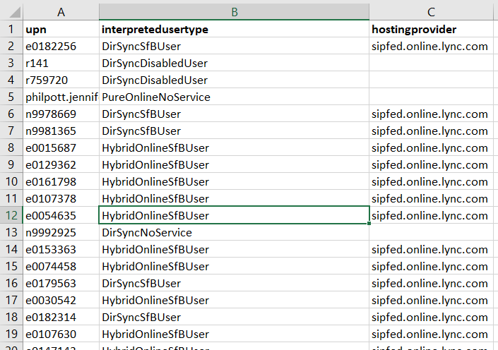
The Skype user list is, unfortunately, comes from a different program.
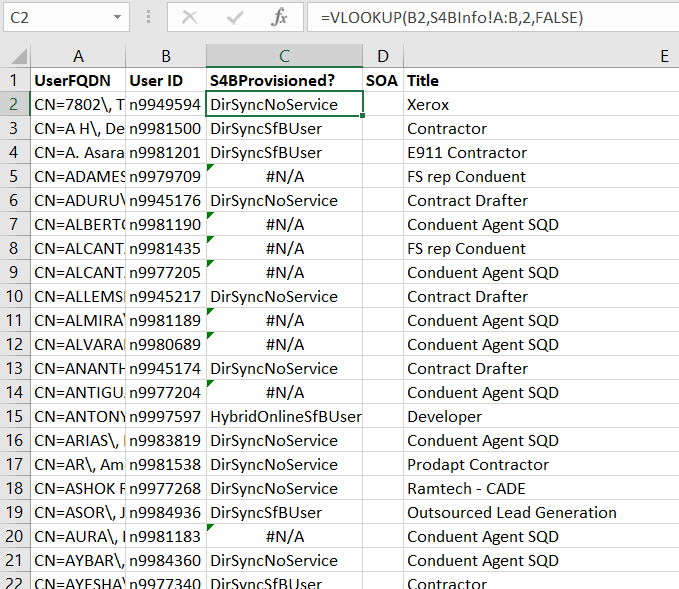
To lookup user IDs from the first table against the Skype info in the second table, I use =VLOOKUP(B2,S4BInfo!A:B,2,FALSE)
The first parameter in the function is the information you want to find, the second parameter is the area where you’ll be looking for the data, the third parameter is the column in that range that you want to return when a match is found. The fourth parameter indicates if you want to find the closest match (‘TRUE’) or an exact match (‘FALSE’). So my formula says “find the value in B2 within columns A and B of the SBInfo tab. Return the value from column 2 of that range, and I want an identical match”.
Note that the third parameter column number may not match the column number in the sheet – if I used the range C:D from the table below, I would still want to return the data in column 2 because my target data is still the second column in the search range.
Fill down and I have a single table that contains both the reporting information that I needed and a column indicating if the individual has a Skype for Business account
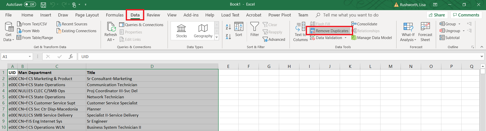
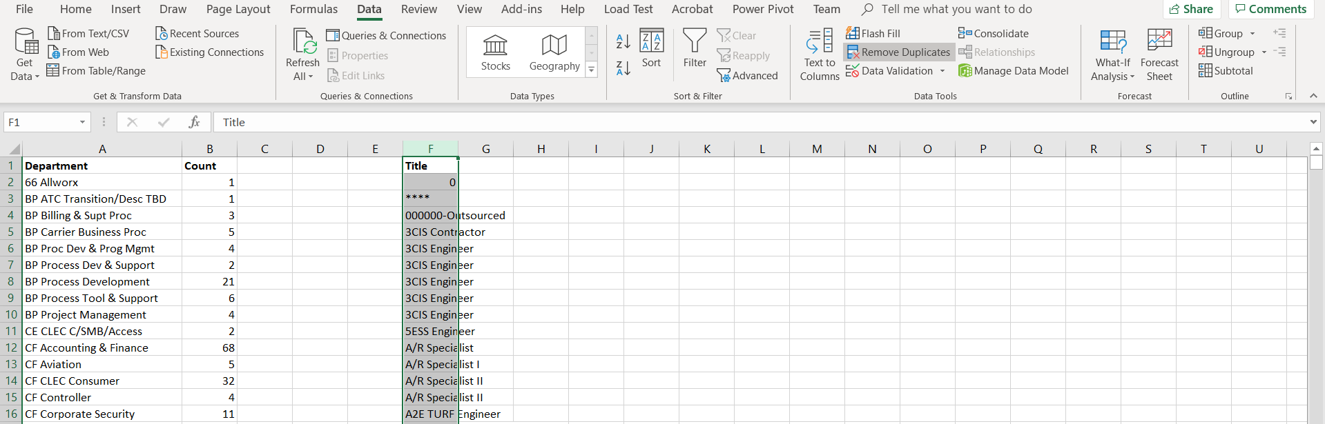
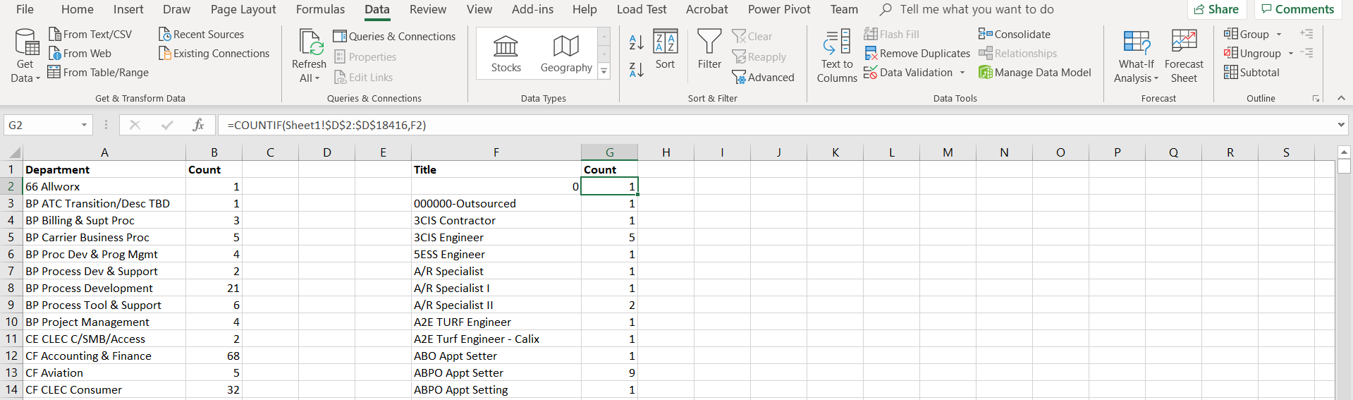
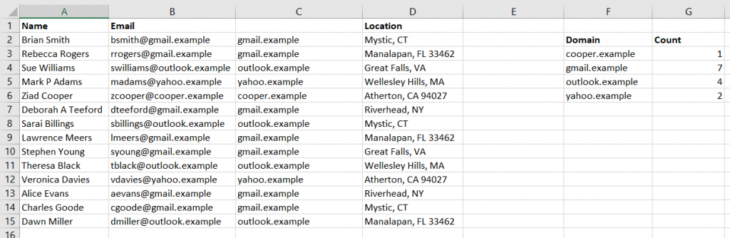
I use Excel’s COUNTIF function a LOT for reporting. When I want to count the number of transactions that occurred per day (or during a date range), it’s easy enough to get the list of IF’s to count. But when I need to find the occurrence of different text strings, I need a unique list of the strings first. “Remove duplicates” quickly exactly what I need.
In this example, I have a list of all employees and contractor’s departments and titles – I want to know how many people are in each department and how many people have each title. Removing duplicates modifies the data, so the first step is to make a copy of the spreadsheet. Highlight the data. Select “Data” on the ribbon bar, then select “Remove Duplicates”
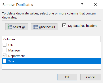
Select the column(s) where you want to remove duplicate data. This could be exact duplicates across multiple columns (e.g. the unique “City, State” combinations), or (in this case) I just want a unique list of departments. Click OK.
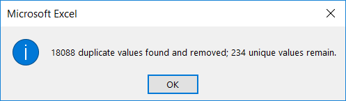
A summary will be displayed showing you how many records were removed and how many unique values remain.
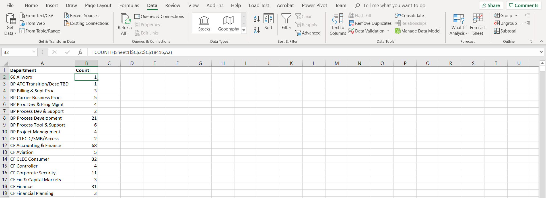
Now that I have a complete listing of departments, I can use my COUNTIF function to show how many employees and contractors are in each department.
Remove duplicates only deletes records within the highlighted data. Here, I have a list of all employee titles next to the department and count info we just created. If I highlight just the ‘Title’ data and click “Remove Duplicates”, the department and count information is left unchanged.
Reading through large tables of data is inefficient – it’s time consuming, error prone, and just not a heap of fun. Graphs are one way to visualize data – allowing you to quickly spot trends, outliers, etc. Excel offers another way to visually enhance data to make it more comprehensible – conditional formatting. Where some charts and graphs obscure the underlying data, conditional formatting allows the exact value to be quickly identified.
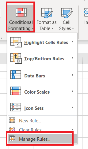
Highlight your data. On the ribbon bar, select “Home” and click the drop-down for “Conditional Formatting”.
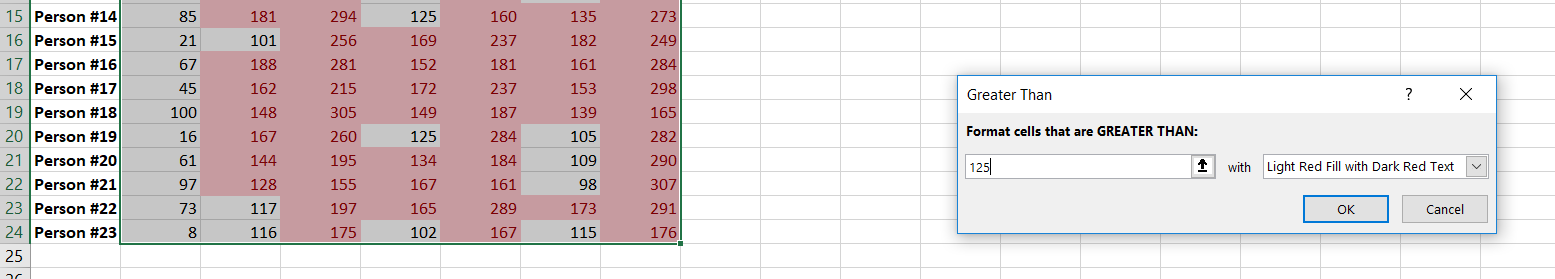
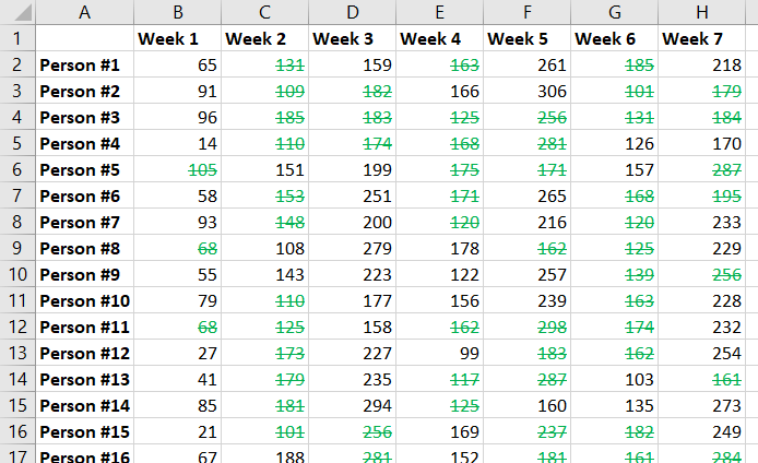
Select the logic to determine which cells are highlighted – we’ll go through a few examples here, but click around on your own! To highlight cells that are higher than some value, select “Highlight Cell Rules” and then select “Greater Than”.
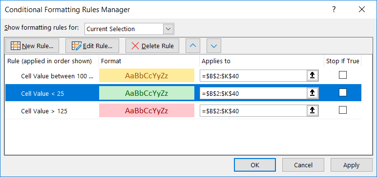
In the window that appears, enter the number and select the colouring scheme. The prepopulated number will be the average of the highlighted data. The changes are applied as you select formatting options, so you have an idea what it’ll look like ahead of time. In this case, there are still a lot of values higher than 125. I could increase my number to reduce the number of highlighted cells. When you have finished composing your formatting rule, click OK.
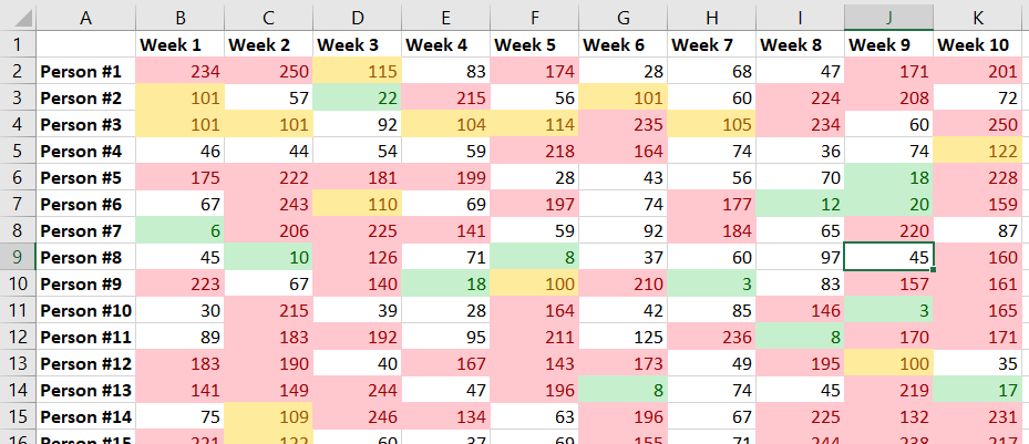
And the format is applied to your data. You can apply multiple formats – add another format to turn anything below 25 green, make values between 100 and 124 yellow. Whatever you want.
If you need to change your formatting rules, click on the “Conditional Formatting” drop-down and select “Manage Rules”.
If your rules do not appear, change “Current Selection” at the top to “This Worksheet”.
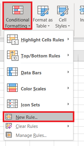
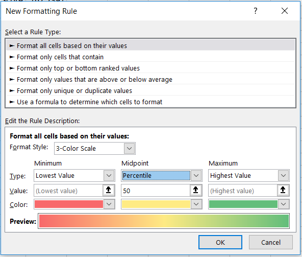
You can also define custom rules. From the “Conditional Formatting” drop down, select “New Rule”.
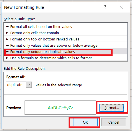
Again, select the logic used to determine which cells are formatted. Here, I am highlighting duplicated values. Click “Format” to define how the highlighted cells should appear. Click “OK” to apply the formatting to your spreadsheet.
Now every duplicated record is in green with a strike through the value.
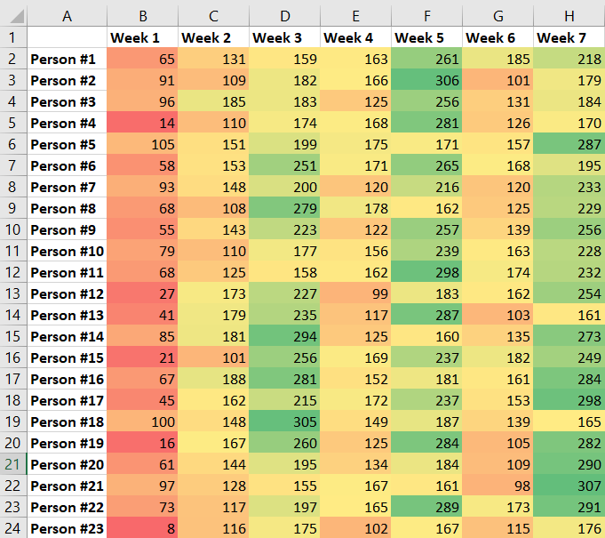
Formatting rules can be nuanced – here I am creating a custom formatting rule that uses a three-colour gradient based on where a value falls within a range.
Now you can quickly compare each value by it’s colour.
I remember visiting my uncle at a NASA design lab sometime in the mid-80’s – it was a huge cavernous room that he explained used to house the computer. A computer his graphing calculator could draw circles around. It was a powerful visual reminder how quickly computing technology advances – components are smaller, more powerful, and simpler to use.
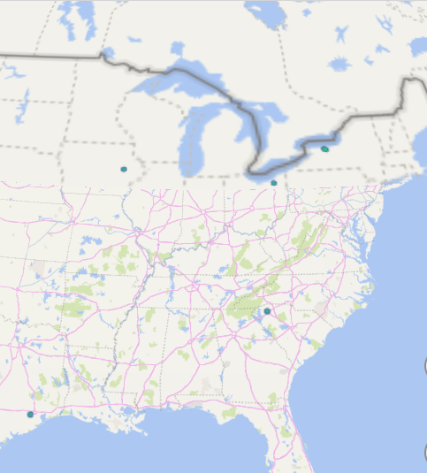
More than two decades ago, I wrote a visualization application that presented a graphical representation of the geographic distribution of records. Which is a long way of saying it showed where something happened to a lot of people. The application was part of a cooperative effort between the FBI and local law enforcement – a data mining project meant to identify serial offenders across jurisdictional boundaries I wanted to be able to visualize where different types of crime were occurring and identify anomalies, so I built a program to do so. It took months to develop and took hours to crunch values and draw a map. The first time I used Excel to visualize frequency distribution on a map, I thought of that NASA computer room. What used to take a high-end Unix server with a RISC processor and tonnes (for the time) of memory – not to mention an entire summer of code development – is clickity-click and done on my little laptop. And the results are nicer:
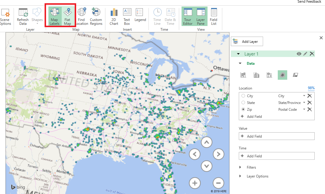
How do you create this type of visualization? First you need data with something that is mappable – the example here is going to show the office locations listed in PeopleSoft. Click within the data set.
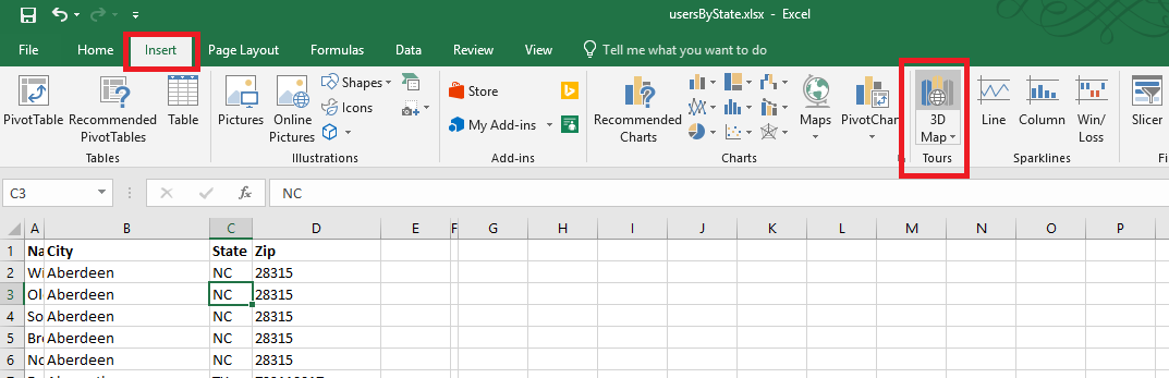
On the ribbon bar, select “Insert” then select “3D Map” in the “Tours” section.
If you have not used it before, you will be asked to enable data analysis service.
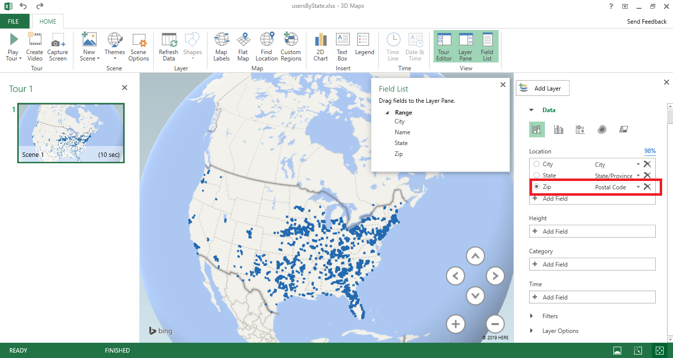
A new window will be displayed – select the column you want to map. Here, I am using zip codes, which is mapped to the “Postal Code” field in my spreadsheet. If your fields do not map automatically, you will need to click the drop-down next to a location data type and select the appropriate column.
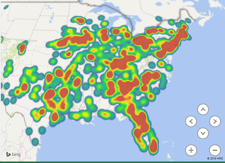
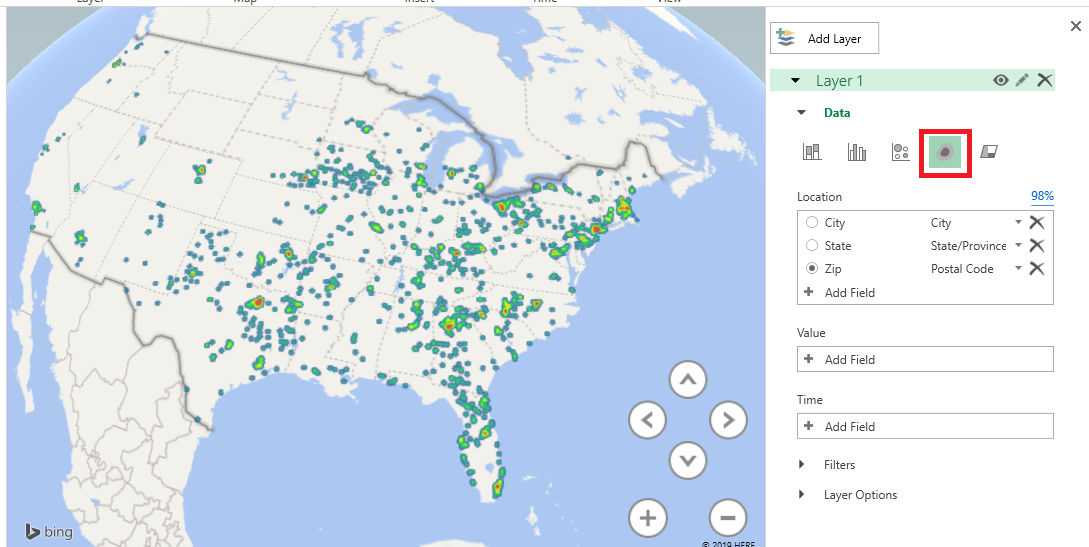
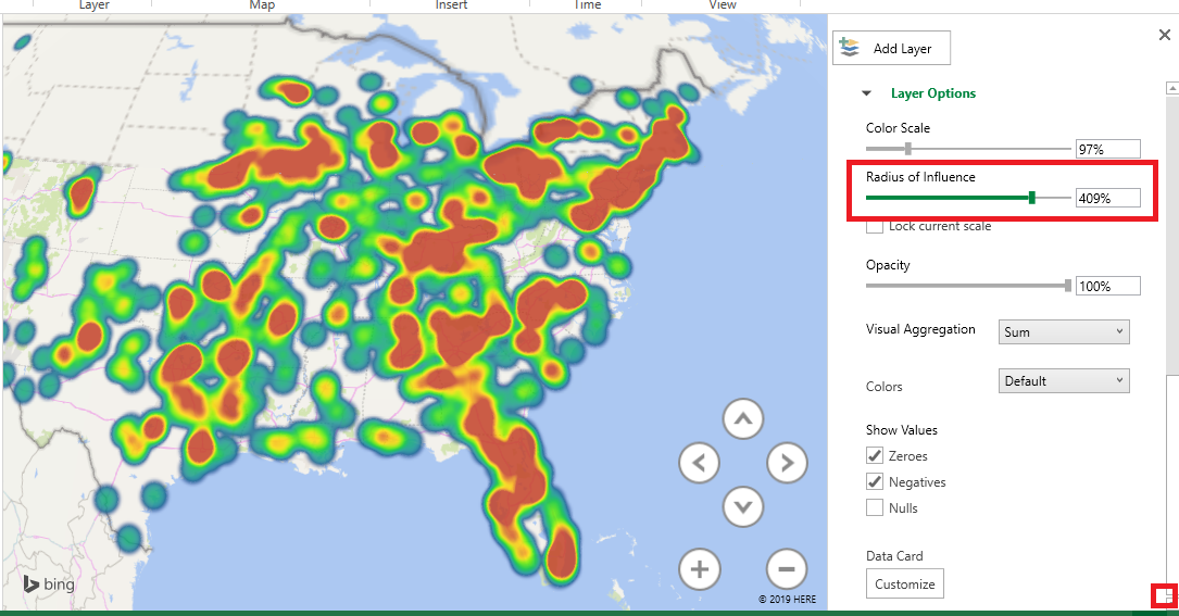
There are different types of visualization – here, I have switched to a “heat map” where the color of the blob represents how many records fall into this zip code. It is a quick way of identifying clusters – hot spots.
You can control the look of the map as well – here, I have switched to a flat map and added location labels.
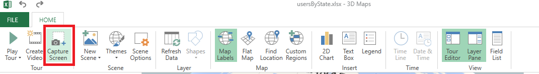
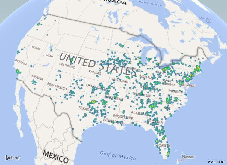
If you would like to include a copy of your map in another program – say, this Word document – select “Capture Screen” from the ribbon bar. You can also create a video to show an animated view of your map (zooming in on specific locations, rotating the globe to see people over in Mongolia)
After you’ve clicked “Screen Capture”, just paste and an image of your map will be inserted into your file – see!
Going A Little Farther:
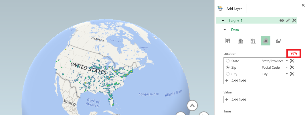
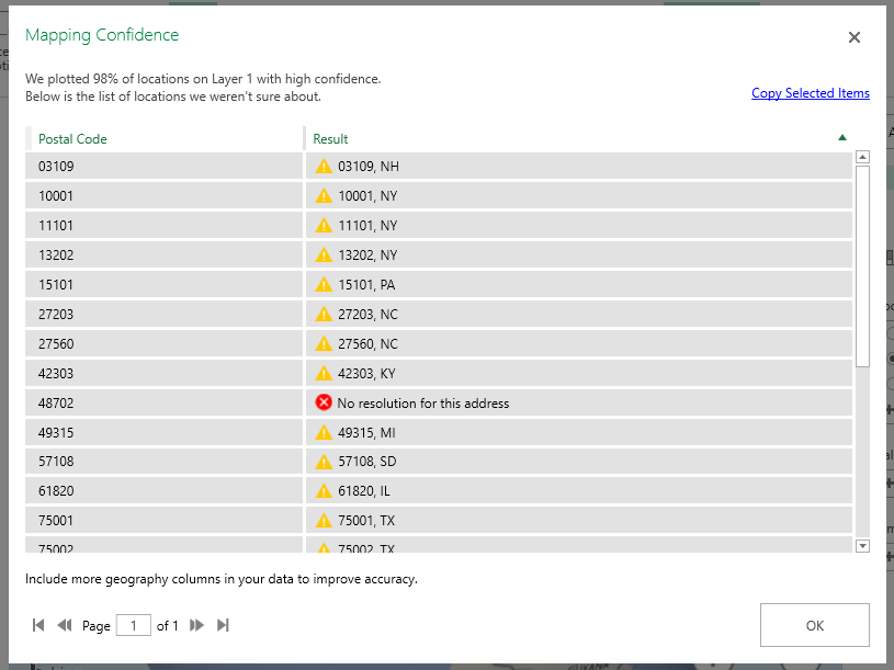
Data isn’t perfect, and even when the data looks good it may not map properly. My sister used to live on a street in New Jersey that does not exist on a map. The post office affirmed it was the correct address, but UPS and FedEx claimed it didn’t exist. It was funny to me, but I wasn’t the one trekking two kids down to the neighbor on the main road who nicely accepted packages for her. She moved before they ever got the address situation sorted, but I’ve got first-hand experience with addresses that don’t map in some systems but are perfectly fine in others. Why do I mention this? The map visualization provides a “Mapping confidence” statistic – it is the percentage that appears above the box where you select the location data to be mapped. 98% is pretty good – there are a handful of records that don’t appear on the map … but the data I am presenting is a decent representation of our employee office locations. A low percentage would indicate that your map does not accurately convey your data.
What if my map confidence level is low? Click on the map confidence value to see what didn’t map. There are some marked with a result that is questionable – spot-checking them, 03109 is Manchester NH and 10001 is New York, NY. The one with no resolution, according to the US Postal Service lookup isn’t a valid postal code. If your data is wrong, fix it 😊 In cases where the data is right but the application isn’t confident about the location, you can add additional data to make the address more specific (here, I might increase the confidence by having the zip+4, or including the street address in my data set).
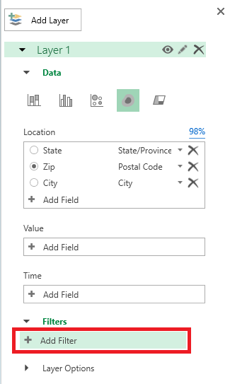
You can filter data in your map – first we’ll need some field on which to filter. Here, I’ve added the employee’s department to my data set.
On the right-hand pane, expand “Filters”. Click “Add filter”.
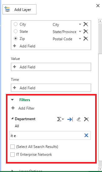
Select the column on which to filter data. A unique list of values will be presented – you can scroll through it or start typing the value to search. Once you find what you want to display, click the check-box before the value.
Now we are visualizing where people in my department work.
If your data is hard to see – records are distributed out fairly evenly across the map – you can increase the area of influence to make smaller clusters easier to identify. Scroll to the bottom of the right-hand pane and drag the “Radius of influence” slider to the right. If you have very clustered data, you can drag the slider to the left to turn a large red blob into a more nuanced visualization.
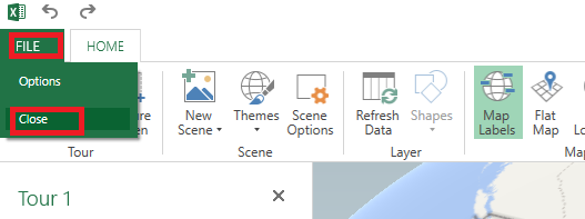
When you have finished visualizing your data, click “File” on the ribbon bar and select “Close”.
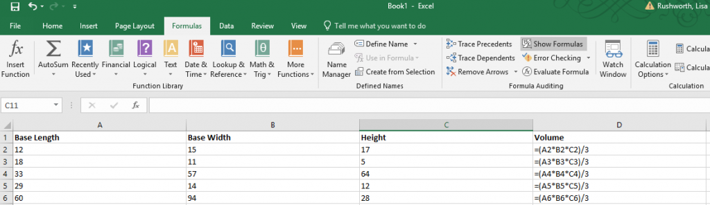
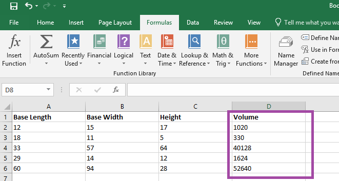
Formulae in Excel aren’t always easy to decode – even a
relatively simple formula, like the volume of a right rectangular pyramid below,
can be a little cryptic with the A2 type cell identifiers.
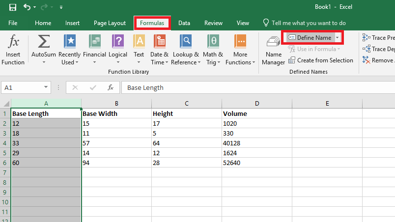
You can name ranges and use range names to make a formula easier to understand. Highlight a data set – in this case, I am highlighting the “length” values – column A. On the “Formulas” ribbon bar, click on “Define Name” (you don’t need to hit the inverted caret on the right of the button – just click the ‘define name’ text).
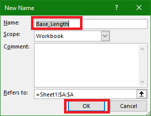
Supply a name for the range – in this case, I am calling it “Base_Length”
(range names need to start with a letter or underscore and cannot contain
spaces). Click OK to save the range name. Repeat this operation with all of the
other data groups – in my case, I named Column B “Base_Width” and Column C “Height”.
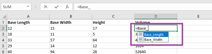
Use the name instead of the cell identifier – as you type
your formula, the range names matching your typed text will appear.
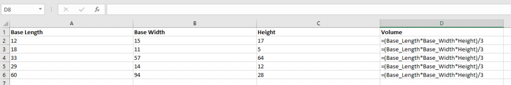
It is now a lot clearer
what this formula means – base length
times base width time height all divided by three. Which is the formula to calculate the volume of a right rectangular
pyramid.
The calculated answer is the same either way – but this
makes it easier to figure out what exactly you were computing when you open the
spreadsheet again in six months 😊 (Or share the
spreadsheet with others).
Applications can generate data in formats that aren’t quite useful – glomming multiple fields
together to make something unusable. And asking people to type information can
yield inconsistent results – is my name Lisa Rushworth, Lisa J Rushworth, or
just Lisa? Excel has several functions that allow you to produce consistent,
usable data (without copy/pasting or deleting things!)
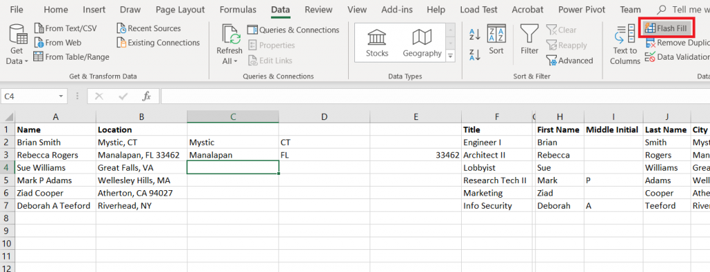
Flash Fill
Flash
Fill will try to figure it out for you. Add an empty column (or more) and manually
type one or two values. On the “Data” ribbon bar, select “Flash Fill” and Excel
will use the data you’ve entered into the row to figure out what should go in
the rest of the row.
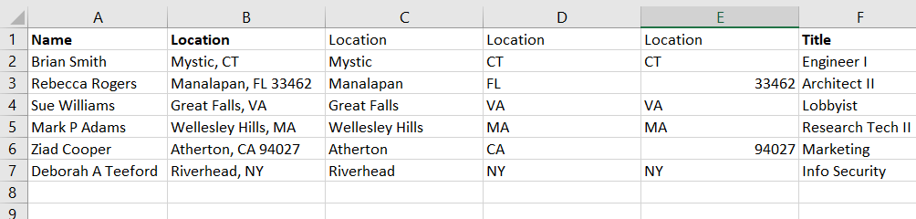
The guesses aren’t 100% accurate – especially if your
information is not consistent – but it’s a lot
easier to delete the handful of things that are obviously not zip codes …
Than to work out a formula that extracts the same
information
Text to columns
Text to columns uses the fixed-length file and delimited
file import wizard on a column of data – essentially treating that column as a
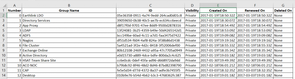
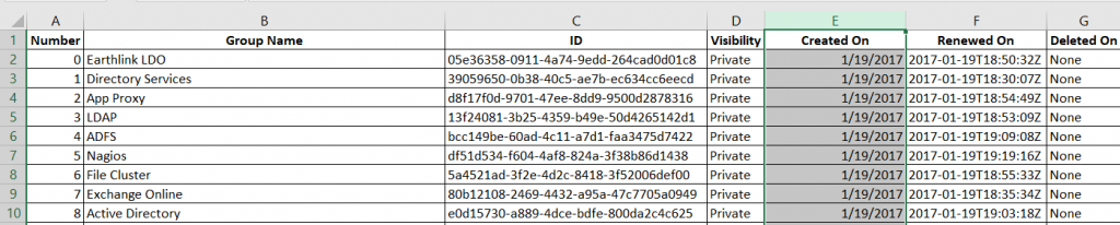
file to be imported. In this example, a DateTime value is provided in a way
that Excel only sees it as a string. And, frankly, I am not interested on the
exact hundredth of a second the event occurred. What I really want to do is group these creation dates by day, so all I
need is the date component.
If you want to retain all the data, you’ll need to insert empty
columns to the right – otherwise the data being split out can overwrite existing data. In my case, I only want to keep one of the new columns.
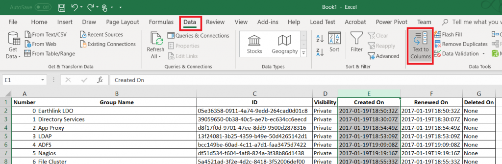
Highlight the column that holds your data. On the “Data”
ribbon, select “Text to columns”
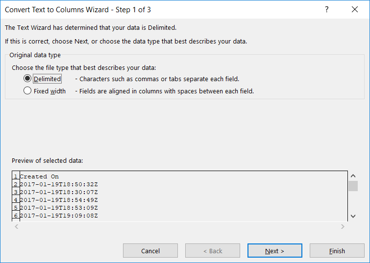
Select if the column should be split based on a fixed width
definition or a delimiter and click ‘Next’
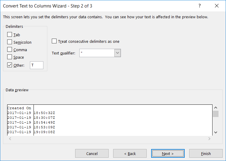
Indicate the proper delimiter – in this case, I need to use ‘Other’
and enter the letter T. A preview of the split data will appear below – make sure
it looks reasonable. Click “Next”.
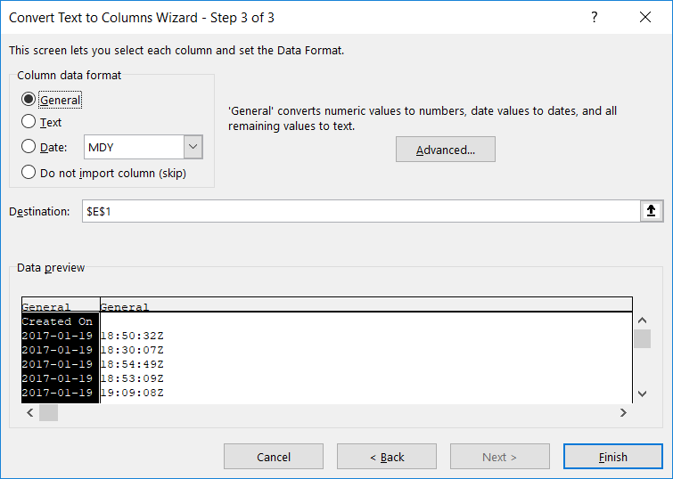
For each new row, you can
specify a data type. Or leave the type set to “General” and Excel will try to
figure it out.
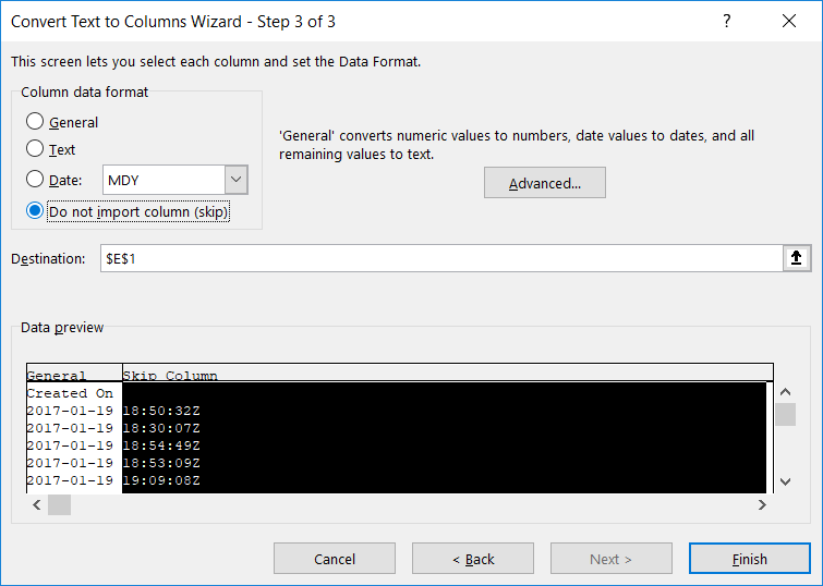
If you do not need to retain the data, select “Do not import
this column (skip)”. Click “Finish” to split your column.
Voilà – I’ve got a usable date value.
Notice, though, I have lost my original data. If you want to
retain the original data, create a
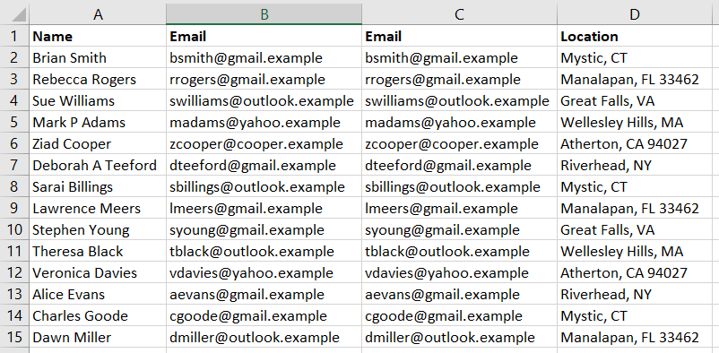
copy of the column. In this example, I want to know how many e-mail addresses
use each domain, but I want to have the e-mail addresses in a recognizable and
usable format too.
Text to columns will still replace the values from the selected column. But the copy will
contain the original text.
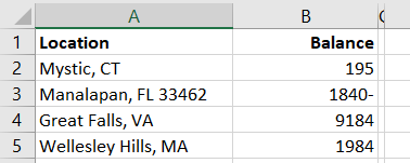
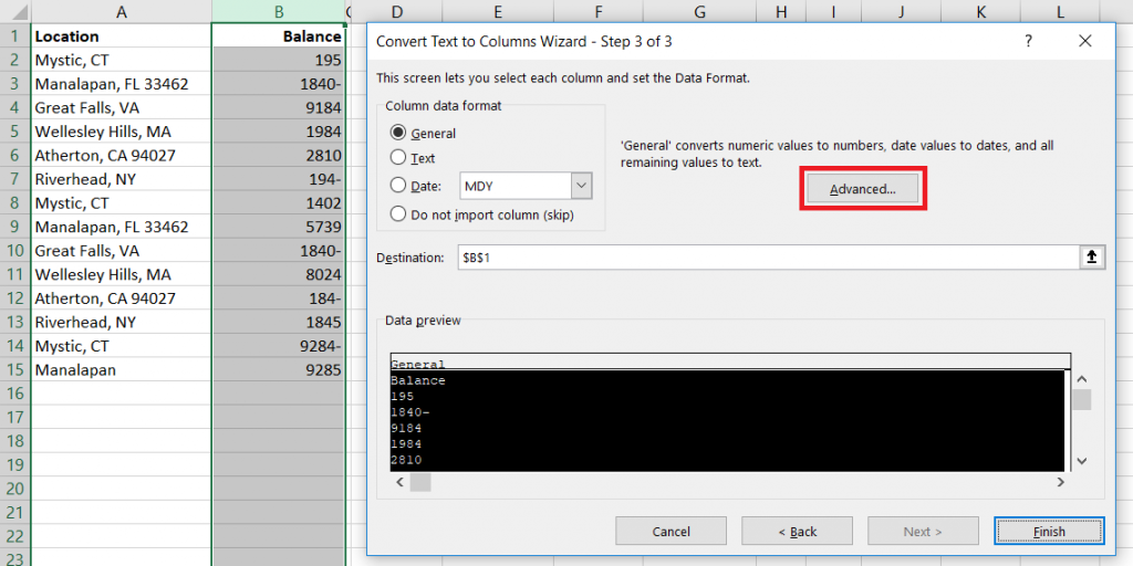
You can even use Text to columns to sort out odd data that doesn’t actually get split into multiple
columns. In this example, negative values have the minus sign after the number …
which isn’t actually a negative
number and isn’t usable in calculations.
Pick a delimiter that doesn’t appear in your data, and you’ll
only have one column. When selecting the data format, click “Advanced”
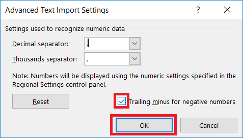
Make sure the “Trailing minus for negative numbers” checkbox
is checked and click OK.
And we’ve got negative
numbers
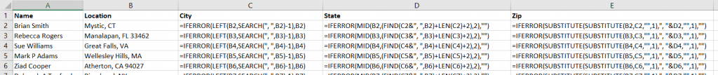
Right, Left, Mid, and Search Functions:
You can also use the Search
function in conjunction with Right,
Left,
and Mid
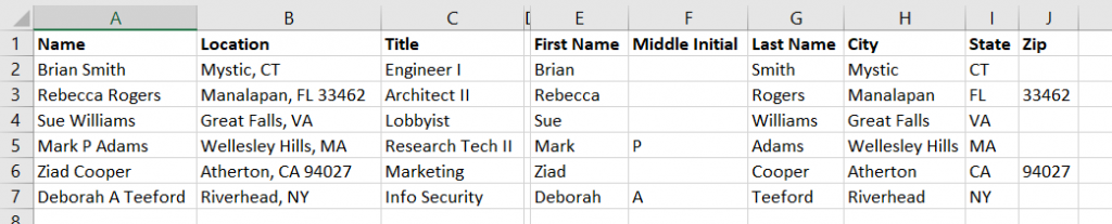
to extract components of column data. In this example, we have first and last
names. Since there are a few middle initials in there, we cannot just split on
the space character.
These formulae aren’t perfect – Mary Ann will have ‘Mary’ as
a first name – but
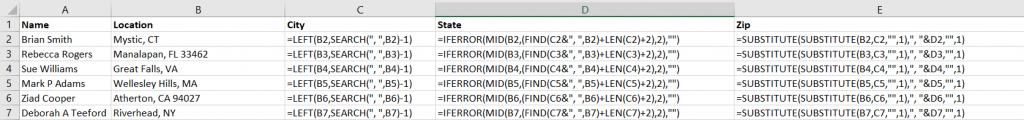
Working out where to start the text extraction and the number
of characters to extract can get complex. I’ll usually include the Substitute
function to simplify things a little – the zip code, in this case, is whatever
is left over after we find the city and state.
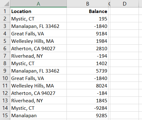
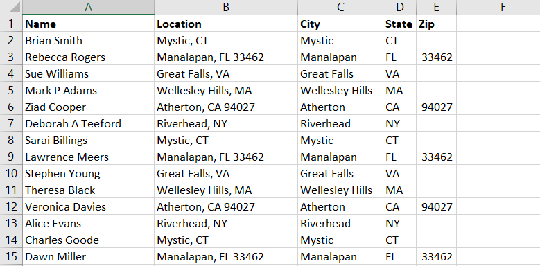
Producing columns with the city, state, and zip code from
the ‘Location’ column.
How many times have you clicked a second time expecting to “paint” your format only to realize the format painter is a one-click deal-e-o. Well, it’s not — you just have to know the trick to ‘locking’ it on. Double click the format painter button — now you can paint as many things with the format as you like.
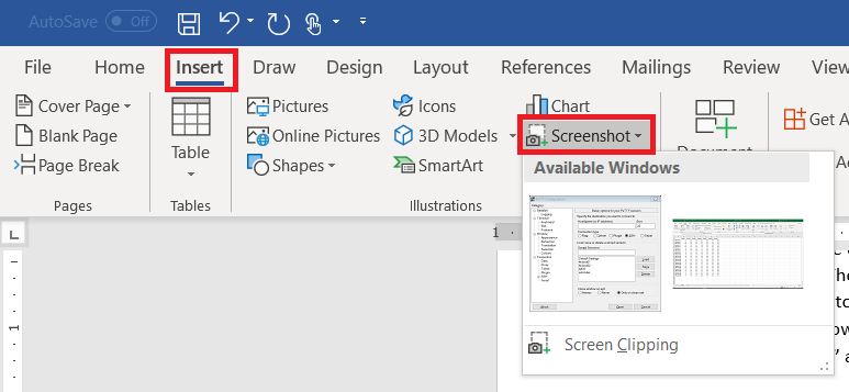
You’ve encountered some odd error in an application and need to send IT support a picture. Or you’rewriting documentation. There are lots of reasons you need a picture of your computer screen. You can hit the “Print Screen” button on your keyboard (even hold Alt and hit print-screen to isolate the image to the active window). But did you know Microsoft Office programs can do that for you? On the ribbon bar, select “Insert” and locate “Screenshot”
Click on one of the “Available Windows”, and an image of the window will be inserted into your Word document, Excel spreadsheet, Outlook e-mail, or PowerPoint presentation.
Use the “Screen Clipping”selection to grab part of a window. Minimize all of your Windows. Bring up the Window of which you want an image. Now bring up the Office document into which you want the image inserted. Use Insert => Screenprint => Screen Clipping, and wait a minute. Your Office document will be minimized, your screen will get washed out, and you’ll have a cross-hair instead of a mouse pointer. Click and drag to draw a rectangle around something. When you release the mouse, whatever is in that rectangle will be pasted into your Office document.
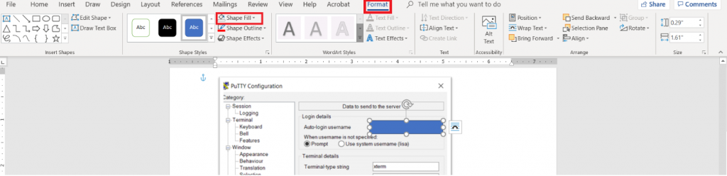
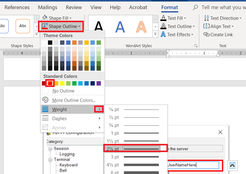
Wait – what about those rectangles I use to highlight the image? From the ribbon bar, select “Insert”and “Shapes”. I took a University course where debugging screen shots had to have the “important bit” highlighted with a red square – that stuck with me. You’ve got an array of shapes and colours available. Pick one. Draw the shape over your image – yes, it looks like the shape covers the important part. Draw it anyway. While the shape is still selected, click “Format” in the ribbon bar. Select “Shape Fill”
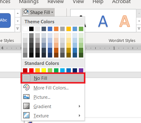
Select “No Fill” (you could also use a highly transparent fill colour if you’d prefer).
Click “Shape Outline” – pick a colour, and if the line is not thick enough select “Weight” to increase the line width.
When I’m writing documentation with a lot of images, I’ll still use an image editor and ‘print screen’. There are filters that just don’t exist in the Office image editors – sometimes I want to selectively blur screen text so my work conversations are not included in documentation. Sometimes I want to create a composite image. But for small documents – showing someone the error I get on their web site, “click here, type this” – using a single application is efficient.