Tag: coronavirus

Is it helping?

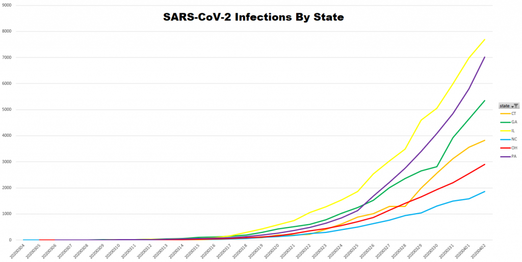
Schools in Ohio have been closed since 17 March (and a lot of districts stayed home on 16 March). Restaurants have been in delivery and carry-out mode for about the same length of time. We’ve been under a stay at home order since 24 March. And the important question is … is it helping? That’s a difficult question to answer because epidemiological predictions have very broad ranges because most of their inputs are so unknown … and the limited testing makes the data being compared wildly inaccurate. But we’ve only got the data we’ve got, so I thought I’d run some comparisons to see how Ohio is faring.

I selected the four states closest to Ohio in population — PA, IL, GA, and NC. Because these states all identified their first case well before Ohio, I added CT because the first case identified there was 08-Mar and Ohio’s first cases appear on 09-Mar.

State 1st Case Population
PA 6-Mar 12,801,989
IL pre 4-Mar 12,671,821
OH 9-Mar 11,689,100
GA pre 4-Mar 10,617,423
NC pre 4-Mar 10,488,084
CT 8-Mar 3,565,287

It looks like our curve is flattened — although North Carolina, where the first infection was identified earlier than Ohio and their their stay at home order was issued on on 27 March, has identified a thousand fewer cases as of yesterday.

Is proximity to NYC a major factor? CT and PA (as well as NJ, which has a relatively high number of cases) are all right there. But Georgia and Illinois are farther away from NYC than Ohio. Is the number of tests a factor in these case numbers? I’d expected a higher correlation between the number of identified cases and the number of tests administered. GA and CT have fewer total test reports (positive + negative tests) and have more infected people. NC has more reported tests, but fewer cases than OH. PA and IL have more reported tests and more infected people.
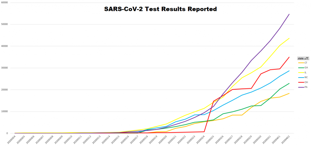
SARS COV-2 Visualizations

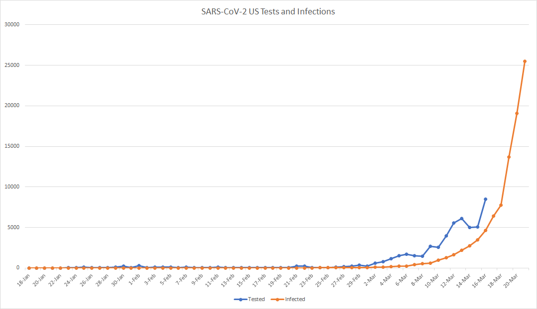
I see charts of the cumulative number of infections (‘the curve’) and the number of tests administered … but comparing the daily number of tests to the cumulative number of infections is not particularly meaningful beyond seeing that the increase in infections is still rather exponential.

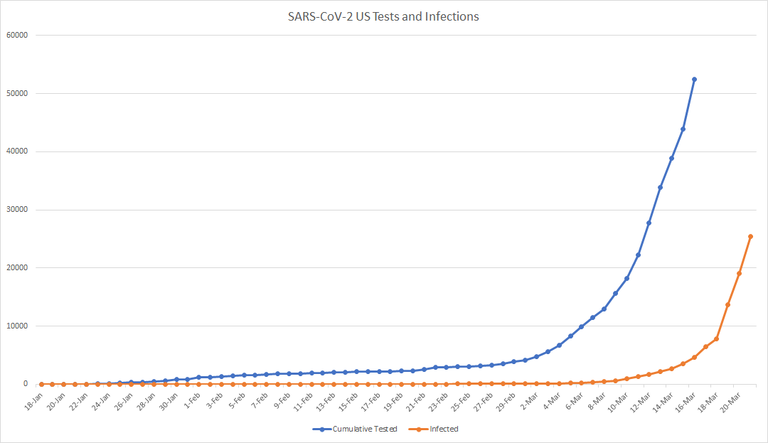
A better visualization compares the cumulative tests to the cumulative infections (or, for less staggering numbers, the daily tests administered and the daily number of new infections identified). No, it doesn’t appear that ‘the curve’ is flattening. I’m curious to see, however, the impact of multiple states going into lock-down has in a week or two.

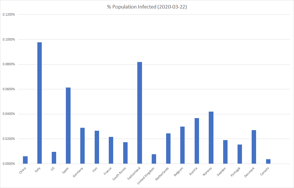
Looking at a number of infections, especially compared across the globe, provides a bit of a distorted view. Comparing countries by the percent of the population that’s been identified as infected instead of the raw number of identified infections avoids the appearance that small countries are less impacted (and that highly populated countries are disproportionately impacted).

Republicanism

Reading this, I cannot help but think the response to this pandemic is playing out according to a fundamental tenant of Republican philosophy. Push power down closer to ‘the people’. Each school district, city/township, county, and state gets to decide how to respond to this virus. In other words, it’s a feature not a bug.
Personally, I think it’s important to have a strong federal government to coordinate things that impact everyone — environmental regulations, educational concerns, energy efficiency, public health. I hope people who push for decentralized government think about how chaotic our response is and extrapolate to how their preferred form of governance can react to other important situations, whatever those may be.
 

SARS CoV-2 Data

Visualization from Johns Hopkins Uni Center for Systems Science and Engineering: https://www.arcgis.com/apps/opsdashboard/index.html#/bda7594740fd40299423467b48e9ecf6

Testing Stats: https://www.cdc.gov/coronavirus/2019-ncov/testing-in-us.html

Interesting combination of data — there have been 13,624 tests (although the data points for the past few days is currently incomplete) and 1,663 infections. That means like 87% of the people who have been tested weren’t infected. Which could be that they’ve been tested before they are infected enough, or it could be that there are a LOT of uninfected people getting tested. Since the actual number of tests is going to be higher, the percent actually infected is lower.