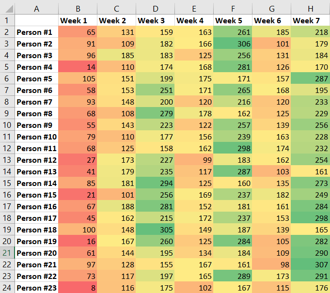
Reading through large tables of data is inefficient – it’s time consuming, error prone, and just not a heap of fun. Graphs are one way to visualize data – allowing you to quickly spot trends, outliers, etc. Excel offers another way to visually enhance data to make it more comprehensible – conditional formatting. Where some charts and graphs obscure the underlying data, conditional formatting allows the exact value to be quickly identified.
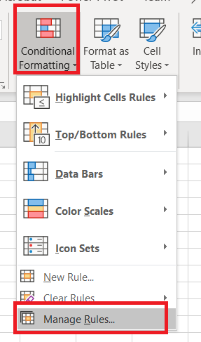
Highlight your data. On the ribbon bar, select “Home” and click the drop-down for “Conditional Formatting”.
Select the logic to determine which cells are highlighted – we’ll go through a few examples here, but click around on your own! To highlight cells that are higher than some value, select “Highlight Cell Rules” and then select “Greater Than”.
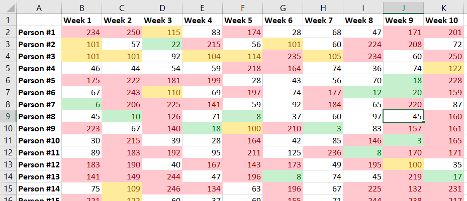
In the window that appears, enter the number and select the colouring scheme. The prepopulated number will be the average of the highlighted data. The changes are applied as you select formatting options, so you have an idea what it’ll look like ahead of time. In this case, there are still a lot of values higher than 125. I could increase my number to reduce the number of highlighted cells. When you have finished composing your formatting rule, click OK.

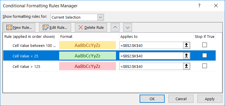
And the format is applied to your data. You can apply multiple formats – add another format to turn anything below 25 green, make values between 100 and 124 yellow. Whatever you want.
If you need to change your formatting rules, click on the “Conditional Formatting” drop-down and select “Manage Rules”.
If your rules do not appear, change “Current Selection” at the top to “This Worksheet”.
You can also define custom rules. From the “Conditional Formatting” drop down, select “New Rule”.
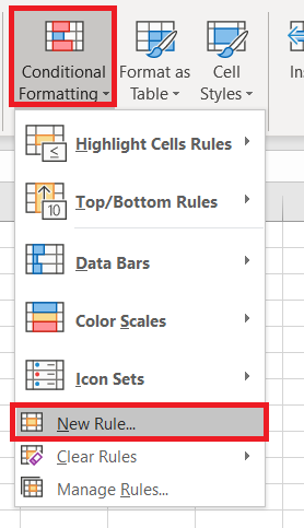
Again, select the logic used to determine which cells are formatted. Here, I am highlighting duplicated values. Click “Format” to define how the highlighted cells should appear. Click “OK” to apply the formatting to your spreadsheet.
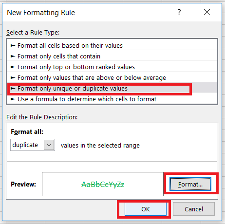
Now every duplicated record is in green with a strike through the value.
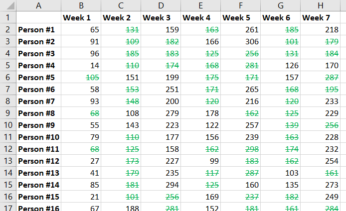
Formatting rules can be nuanced – here I am creating a custom formatting rule that uses a three-colour gradient based on where a value falls within a range.
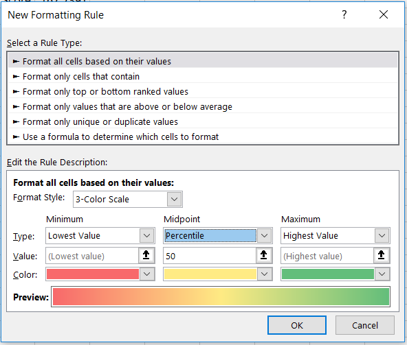
Now you can quickly compare each value by it’s colour.
