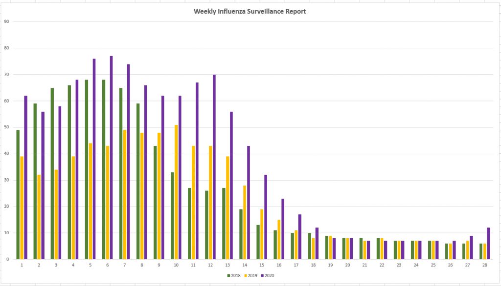
Scott hypothesized that 2020 should have a fairly low rate of illness apart from SARS-CoV-2. The preventative measures taken to limit the spread of this virus should also have reduced the number of people with colds, flu, etc. There’s no way to tell for mild illnesses, but I knew the CDC tracked flu and pneumonia cases … you can link the CDC’s CSV data sources into Excel, create a Pivot table to get rows of week numbers or months & columns of year-by-year case counts, then create a chart that compares case counts year-to-year. Unfortunately, they have a new file name each week. You’ve got to find the latest URL from https://www.cdc.gov/flu/weekly/index.htm
I was surprised to see 2020 significantly higher than the previous two years through the end of April and bumping back up again between weeks 26 and 27 (late June / early July)
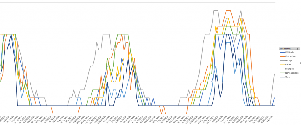
Broken out by state and filtered to a few states to make the chart readable, I see the same trend. 2020 is generally higher than 2019 or 2018.
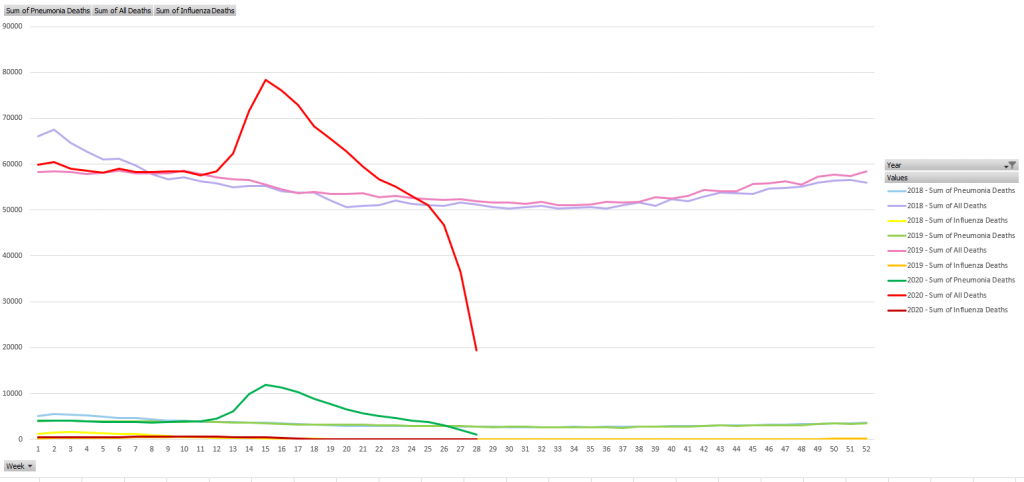
The significant increase in pneumonia deaths this year? That’s probably not people who actually had pneumonia completely unrelated to SARS-CoV-2. The influenza/pneumonia data set includes an “All Deaths” column — which depicts the excess deaths for 2020 (I assume the past month or so of data is not yet finalized, as thee numbers fall off sharply in the final weeks of the data set).


